 海报设计2
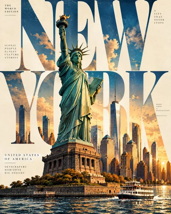
巨型字母旅行封面:建筑从字体中穿出
以超大目的地名称作为建筑结构,让地标在字母之间穿插。配色不超过三种,保留杂志刊头与副标题;使用真实地标并核对地名拼写。
原作者示例 · @Naiknelofar788 · 未经本站复现
让超大城市名溢出画幅,与中部黑白建筑照片重叠。黑底、暖灰和石米色建立非对称网格,保留清晰层级与留白。
QCreate a striking, high-fashion architectural editorial poster featuring [CITY / COUNTRY / LANDMARK], inspired by vintage Swiss graphic design, brutalist architecture magazines and experimental typography.

Composition and layout:

* Use an oversized, bold uppercase destination name across the top of the composition.
* Let the typography extend beyond the edges of the canvas, creating dramatic cropping.
* Place a large rectangular black-and-white architectural photograph in the centre, partially overlapping the giant letters.
* Feature the destination’s most recognizable landmark, skyline or architectural structures in the photograph.
* Create an intentional contrast between typography and photography, allowing both elements to interact visually.
* Use a deep black background with warm grey, stone beige or muted ivory lettering.

Typography:
Choose an extremely bold, heavy serif or condensed editorial typeface. Make the destination name the dominant visual element. Experiment with cropped letters, oversized scale and unconventional spacing.

Photography:
Use authentic-looking monochrome architectural photography, dramatic natural shadows, strong geometric lines, deep blacks, subtle film grain and vintage photographic texture.

Art direction:
Minimalist, intellectual, sophisticated, experimental and timeless. Inspired by independent architecture journals and luxury design publications.

Technical composition: Vertical 4:5 format, asymmetrical editorial grid, generous negative space, high contrast, premium print aesthetic.

Important: Keep the landmark recognizable, maintain a clean visual hierarchy, avoid colourful illustrations, decorative graphics, gradients and unnecessary text. The final artwork should look like an exclusive architectural magazine cover rather than a conventional tourist poster.
模型信息按原帖记录。生成效果可能随模型版本和参数变化。了解内容说明
海报设计2以超大目的地名称作为建筑结构,让地标在字母之间穿插。配色不超过三种,保留杂志刊头与副标题;使用真实地标并核对地名拼写。
 海报设计2
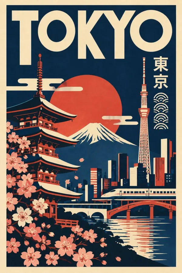
结合 20 世纪中期现代平面设计、大字标题与地方文化符号。每座城市选择独立配色,地标、动植物和纹样需要符合目的地。
 海报设计
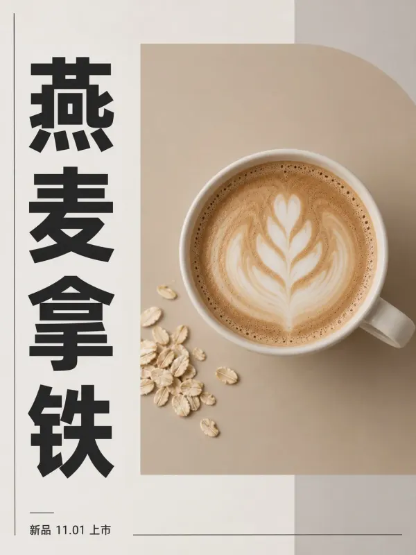
暖灰白纸底、竖排黑体与低饱和矩形组成非对称网格。保留咖啡新品的完整示例提示词,修改 New subject 可换主题;其他活动示例未收录。