 产品设计2
动漫角色与 70 年代国货包装联名
让现代成年动漫或游戏角色融入 70 年代国货包装,以三分之四视角展示材质和版式。原文要求 10 张逐张输出,实际使用需按单次任务调整数量,并留意角色授权与署名。
原作者示例 · @ou_zhen599 · 未经本站复现
用 S 形巧克力道路将视线引向悬崖上的金箔榛子巧克力,左侧保留品牌文字。原文较长,复制后请留意画布 5000 字符限制;示例品牌名与标签按原文保留。 画幅按示例图标注,原文未指定比例。
Create a premium overseas luxury chocolate advertising poster for original confectionery brand AURÉLIS D’OR, centered on one monumental gold-wrapped hazelnut praline as the hero product. The image is a cinematic commercial fantasy landscape: a giant crinkled golden chocolate sphere rests on a refined cliffside valley, while a wide glossy chocolate ribbon road spirals upward toward it in a powerful S-curve. The atmosphere is early morning champagne gold, soft, luminous, and luxurious. The concept is a sweet journey toward gold: the product becomes destination, architecture, and desire.

Use a vertical full-bleed poster with a wide scenic view and slightly low sweeping perspective from the chocolate road in the foreground toward the giant praline in the upper-right midground. The foreground chocolate road enters wide from the lower-right edge, curves through the center, then climbs toward the product. The left side keeps open pale sky and distant valley haze for restrained brand typography.

The giant gold-wrapped praline dominates the upper-right third, perched on a lush rocky terrace above a champagne-lit valley. The chocolate road forms an elegant S-shaped path, wraps around the cliff base, and leads the eye directly to the praline. Tiny adult visitors appear only as scale cues on terraces and path. Controlled hazelnut pieces, wafer crumbs, and small chocolate fragments scatter along the road. Product, road, sunrise glow, and logo create one clean diagonal reading path.

The hero product is a realistic luxury hazelnut praline: round chocolate form wrapped in crinkled metallic gold foil, dark brown pleated paper cup at the base, and a small oval ivory label on the front reading exactly:
“AURÉLIS D’OR”
“HAZELNUT PRALINE”
The foil must feel physically credible: fine crinkles, warm gold highlights, darker folded valleys, soft specular reflections, and believable wrapping tension around the sphere. The chocolate road is glossy dark milk chocolate with smooth thickness, curved reflections, and scattered hazelnut fragments, not a plastic slide.

The praline sits firmly on a rocky green cliff terrace, far larger than surrounding architecture and people. The chocolate ribbon road is physically attached to the landscape, with rounded chocolate edges and believable contact with crumbs and nuts. The valley, water, terraces, and distant architecture remain secondary and atmospheric so the product stays dominant.

The background is a soft champagne-gold morning valley: pale sunrise sky, delicate clouds, distant water, faint city silhouettes, terraced greenery, and warm cliffside architecture. Depth comes from the large foreground chocolate curve, midground terraces, monumental praline, distant valley, and atmospheric haze. Keep the world elegant and clean: no candy overload, factory, supermarket shelf, extra packaged products, or decorative border.

Soft morning sunlight enters from the lower-left horizon, creating champagne-gold rim highlights on foil, chocolate road, terrace edges, and hazelnut crumbs. Gentle cool sky fill preserves shadow detail on the cliff and chocolate folds. Palette: 60% champagne gold and pale sunrise amber, 20% chocolate brown and dark cocoa, 10% soft coastal blue haze, 10% greenery and ivory typography. Shadows stay rich and readable, never dead black.

The praline foil is the sharpest and most detailed element: crisp metallic crinkles, readable oval label, pleated paper cup folds, and believable rounded volume. The chocolate road has glossy thickness, smooth curvature, warm reflections, and accurate contact with hazelnut pieces and crumbs. The cliff has controlled rock texture and refined greenery; terraces and tiny people are secondary. Typography is sparse, elegant, and quiet, never discount-style or overly decorative.

Use only English text. Upper-left brand lockup in elegant serif lettering:
“AURÉLIS
D’OR”
Above it, place a small pyramid-like icon made of tiny golden praline dots.
Lower-left small headline in thin spaced uppercase:
“A SWEET
JOURNEY
AWAITS”
Bottom-left micro line:
“HAZELNUT PRALINE / GOLDEN CHOCOLATE COLLECTION”
On the praline label, write exactly:
“AURÉLIS D’OR”
“HAZELNUT PRALINE”
Do not add prices, fake awards, certifications, nutrition claims, random small print, real brand marks, real product names, or copied slogans.

Output: full-bleed vertical luxury chocolate poster, no border, no black frame. Preserve the monumental product-on-cliff structure, wide S-shaped chocolate journey road, champagne morning valley atmosphere, hazelnut flavor cues, refined left-side typography, and premium confectionery mood. Avoid warped praline sphere, unreadable label, floating product, broken road perspective, cluttered candy landscape, oversized people, product hidden by architecture, plastic-looking foil, muddy chocolate, dead black shadows, overexposed gold, greasy road surface, dirty crumbs, uncontrolled glare, excessive sparkles, misspelled brand text, duplicated labels, cartoon candy world, cyberpunk lighting, chaotic fantasy overload, low-resolution foil texture, or generic dessert stock styling.
此原文超过画布当前的 5000字符上限,请精简后使用。复制内容保留完整原文。
模型信息按原帖记录。生成效果可能随模型版本和参数变化。了解内容说明
产品设计2让现代成年动漫或游戏角色融入 70 年代国货包装,以三分之四视角展示材质和版式。原文要求 10 张逐张输出,实际使用需按单次任务调整数量,并留意角色授权与署名。
 产品设计2
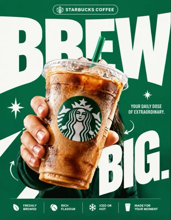
超大字号 + 强透视产品的商业广告海报模板,用分区结构(布局/主体/文字系统/反套路)精确控制版式,可换成任意品牌。
 产品设计2
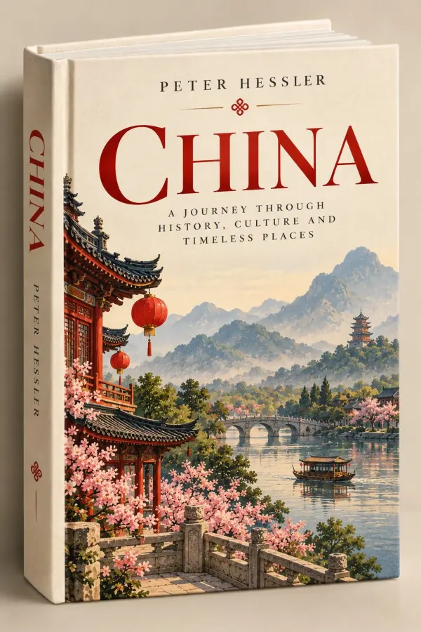
把目的地做成一本立在米色棚拍背景前的精装旅行书:衬线书名、复古水彩插画封面、可见书脊,适合做成系列。